Pie Charts (yum!)#
Before Baking

After Pies are Covered in Crumble

What is a Pie Chart?#
Pie charts are the best visualization because they are delicious! Ok, so we don’t mean acutal pies.. Pie charts use categorical data and display how much of your data fall into each category. Pie charts are a circle divided into slices, just like an actual pie. We saw a pie chart at the beginning of this unit in the notebook titled Unit 2-01 Intro to Visualizations. The circle (or Pie) represents all of the data. Each slice represents a different category. The size of each slice is based on what proportion of the data falls into the respective category. See below for another example of a pie chart.
Illustration 1: Pie Chart of Revenue from Customers#
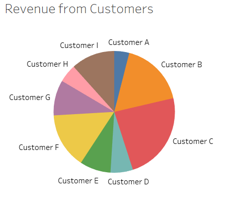
Illustration 1 presents a pie chart for a company’s revenue split up by customer. The pie chart is an easy way to quicly understand the portion that each customer makes up of total revenue. From the pie chart you can see which customers are the largest revenue generators and which are the smallest. This pie chart is different from the one at the beginning of the unit as it does not include percentages. Pie charts can also include numerical data to aid in the effectiveness of the visualization.
When to Use a Pie Chart#
Pie charts are used to display the composition of your data. Specifically, a pie chart is useful when you would like to know about the proportions of your data and how the data fall into different categories.
Creating a Pie Chart in Tableau#
Watch this video to learn about pie charts in Tableau: