Introduction to Visualizations#
Overview#
Now that you understand some basic Python coding, we can show you the real power of data analytics. The goal of data analytics is to extract meaningful information from large amounts of data. One way to present the insights found in data analytics is through visualization. Visualization is just a fancy word for representing your data in a visual format through graphs, charts, pictures, etc. While analyzing data is important, the goal of data analytics is to answer questions and provide information to another party. Visualizations help convey the important information in an easily digestible format.
Let’s say you have an investment account and you invest in a variety of different types of stocks. You would like to understand the composition of your investment portfolio. To do this, you can present the allocation of your investment portfolio in a variety of ways. Below we present the same information twice. Which presentation of the data more easily allows you to understand the composition of your portfolio?
Illustration 1: Presentation of Data in a Table#
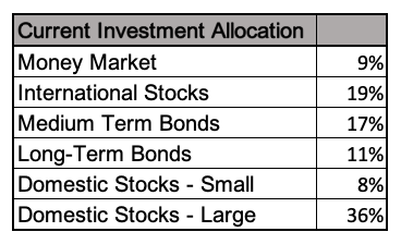
Illustration 2: Presentation of Data in a Pie Chart#
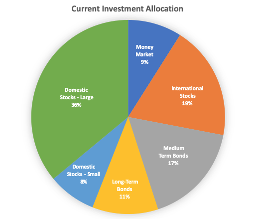
Although both the table and the pie chart present the same information, the pie chart allows the reader to quickly grasp the composition of your investment portfolio. This example illustrates the purpose of this unit: to demonstrate the power of visualization and show you how to create appropriate visualizations for your business problem. By the end of this unit you should be able to choose the most appropriate visualization for the question you are trying to answer with your data.
The rest of this unit introduces you to common visualizations, provides you with guidance about when to choose which visualization, and walks you through creating these visualizations in Python using a package called Bokeh. At the end of the unit we will switch gears and create visualizations using Tableau, a software package that specializes in visualizations.
Types of Visualizations#
There are MANY types of visualization and we could spend weeks talking about all of the possible visualizations you can create. However, in this class we will focus on the following eight visualizations:
- Bar Chart
- Histogram
- Box Plot
- Scatter Plot
- Line Chart
- Pie Chart
- Heat Map
- Location Based Map
This is not to say that other visualizations are not important or useful. We just believe that for most of the questions you will see in the real world, and for all of the questions you will face in this class, you will generally use one of the above eight visualizations.
Choosing the Best Visualization for Your Question#
Choosing the best visualization is completely dependent on the question you are trying to answer and the variables you have to answer that question. There are two kinds of questions you should ask. The first and most important question you should answer is “what is the purpose of my visualization?” The first set of questions presented here will help you pick a visualization based on this important question. After you have gone through these questions you will probably have narrowed down the possible visualizations. Other important questions relate to the data you have available. Some visualizations require certain types of data. Therefore the second set of questions relates to the data available and what visualizations are possible with your data constraints.
Questions to help you answer “What is the purpose of my visualization?” and to help you pick a visualization#
This list of questions is not exhaustive when trying to pinpoint the best visualization, but it should help you start to critically think about the purpose of your visualization and what visualizations might fit best with this purpose.
- Do I want to understand the composition of the data?
- If yes, how many variables are you trying to understand?
- One Variable - Pie Charts are useful in understanding how the data is split up for a single variable (e.g., of your total expenses, what proportion fall into COGS, what proportion fall into SG&A, etc.)
- Two Variables - Heat Maps are useful in understanding how your data is split up across two variables (e.g., of all your expenses, what proportion fall into COGS for Unit A of the company, what proportion fall into COGS for Unit B of the company, what proportion fall into SG&A for unit A of the company, what proportion fall into SG&A for Unit B of the company, etc.)
- Do I want to understand the distribution or shape of my data?
- If yes, what characteristics about the distribution am I interested in?
- Am I interested in outliers? If yes, Box Plots may be useful in identifying outliers for a single variable, and Scatter Plots can help when you have two variables.
- Am I interested in whether the data is symmetrical or skewed? If yes, Histograms or Box Plots may help with this.
- Am I interested in whether my data follow a certain distribution pattern (e.g., normal distribution, uniform distribution)? If yes, Histograms will help with this.
- Do I want to know the min, max, median, 25th percentile, 75 percentile, or understanding the quartiles of the data? If yes, Box Plots may help with this.
- Do I want to know if the data is concentrated around a particular number? If it is a single number, both Box Plots and Histograms are useful, however if it is multiple numbers, then a Histogram will be most useful. Scatter Plots can help with this a little bit if you have more than one variable.
- Am I trying to make comparisons across variables?
- If yes, what kind of comparison am I making?
- Comparing across locations? Location Based Map is useful.
- Comparing size? Bar Charts if there is one variable, Heat Maps and Bar Charts if there are multiple variables.
- Comparing proportions? Pie Charts are most useful.
- Comparing distribution characteristics? Multiple Box Plots help with this, and sometimes multiple Histograms.
- Comparing changes in variables across an interval like time? Line Charts are useful for this question.
- Am I trying to understand a relationship or correlation between two variables? In other words am I interested in how the change in one variable impacts the change in another variable?
- If yes, then a scatter plot is the most useful.
- Do I want to understand how a variable changes over time?
- If yes, Line Charts are most useful for this question.
Questions to understand the constraints of your data in picking a visualization#
- Is my data continuous/discrete or categorical?
- Visualizations that use Continuous Data (or Discrete Data):
- Histogram
- Box Plot
- Line Chart
- Scatter Plot
- Heat Map
- Location Based Map
- Visualizations that use Categorical Data:
- Bar Chart
- Pie Chart
- Heat Map
- Location Based Map
- Box Plots if you have more than one box and whiskers
- Line Chart if you have more than one line
- How many variables do I want to examine?
- Visualizations that can be used to examine one variable:
- Pie Chart
- Box Plot
- Histogram
- Visualizations that can be used to examine more than one variable:
- Bar Chart
- Scatter Plot
- Box Plots
- Heat Map
- Location Based Map
- Line Graph
- Is one of your variables of interest time? Line Charts are probably most useful.
- Is one of your variables of interest location? Location Based Maps can be used.
Conclusion#
After you learn how to make visualizations you can impress all of your friends, see…