Bar Charts#
What is a Bar Chart?#
A bar chart presents categorical data using bars (horizontal or vertical rectangles). Categorical data means that the data are separated into categories or groups. Below are a few examples of categorical data:
- Favorite types of food: Italian, Mexican, Thai, Chinese, Japanese, Korean, Indian, American, etc.
- True or False
- Income Statement Line Items: Revenue, Cost of Goods Sold, SG&A Expenses, Income Tax Expense, Other Income or Gains, Other Expenses or Losses
A bar chart uses bars for each category. The categories are listed on one axis (either the X or the Y axis), and the frequency or value is listed on the other axis. See examples of bar charts below:
Illustration 1: Horizontal Bar Chart#
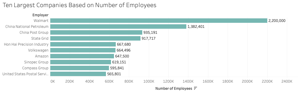
Illustration 1 presents the largest companies in the world. In this graph, company size is measured by the number of employees. Thus, the categories are the company names and the value being measured is number of employees.1
Illustration 2: Vertical Multiple Bar Chart (A.K.A. Clustered or Stacked Bar Chart)#
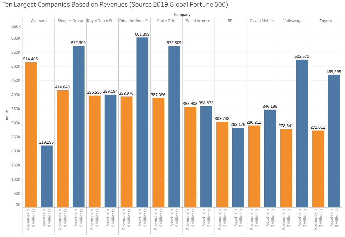
Illustration 2 also presents the largest companies in the world. However this visualization uses a different measure to determine size. In this bar chart the measure or variable used to determine the largest companies is revenue. Additionally, this bar chart differs from Illustration 1 because there are two bars for each company. The second bar displays the dollar value of all the company’s assets. Bar charts can have sub categories (e.g., revenue and assets) presented as clustered bars within each larger category (e.g., each company).2
When to Use a Bar Chart#
Bar charts are useful when ranking items as you can easily visualize the level of a variable based on the height of the bar. You can also order the bars from largest to smallest, as we see with Number of Employees in Illustration 1 and Revenue in Illustration 2. Bar charts can also be used for comparison across categories or within categories.
Creating a Bar Chart in Tableau#
Watch this video to learn how to create a bar chart in Tableau:
https://youtu.be/6AshrP5d7G8?si=aWSFC2boHk-PDIjx
References#
1 “Largest Private and Semi-private employers” https://en.wikipedia.org/wiki/List_of_largest_employers Accessed on July 21, 2019.