Creating Visualizations with Python#
The Visualization Landscape in Python#
The Python “ecosystem” is decentralized. Anyone can contribute to the existing code base, and anyone can create packages (modules) for others to use. No central body regulates this process. This approach has yielded some advantages and some disadvantages. The advantages are that Python has a very rich ecosystem of cutting-edge packages for machine learning, statistics, artificial intelligence, and yes, visualization. The disadvantage is that there are often multiple competing packages that cause confusion among new users.
There are literally dozens of visualization libraries available in Python. In fact, someone at the Anaconda company created this visualization to help users visualize (no pun intended) the relationships among the Python visualization libraries. See here:
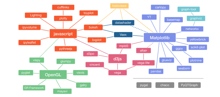
Each of the packages shown in the graph above have their advantages and disadvantages. Some are better for certain types of graphics; for example, Seaborn, which inherits from Matplotlib, is designed for statistical graphics. Some packages are extremely powerful but difficult to learn. Some are easier to use, but only produce a few simple graphics. Some, like datashader, are designed to work with extremely large data. Some produce static output (like pictures) while other libraries produce interactive graphs. And, to make matters more complicated, the developers of all these libraries are constantly improving their libraries. Thus, choosing a library to invest in is not an easy decision!
Notice that, in the graph above, there are a few libraries whose names are in bold. These are popular packages that other packages “inherit” from. One of those is Matplotlib (in purple). Matplotlib is, by far, the most popular Python library for visualization. It has been around since 2003 and has a large user base. There are many articles, tutorials, and posts about Matplotlib. However, we are not going to show you Matplotlib. We find it clunky, difficult to customize, and frankly, somewhat ugly. Matplotlib produces static graphics that are not interactive.
In the center of the teal bubbles is JavaScript, a programming language that is one of the backbones of the web. JavaScript is a programming language that allows websites to run code in your browser. That allows for interactive graphics, like you will find in Tableau. In this course, we are going to teach you the basics of a library called Bokeh (which inherits from JavaScript). Bokeh provides interactive plots and has a relatively simple syntax.
Why Bokeh?#
Our goal is to make you proficient in Tableau. Many employers recognize Tableau and use it. Tableau is fairly easy to use, and having Tableau on your resume will likely increase your appeal to prospective employers. However, as we point out in Unit 2-1, we want you to possess a deep understanding of the different types of visualizations and how they are created. Tableau does not encourage that. We have seen too many occasions where Tableau does something weird and does not give the user what they expected.
To deepen your understanding of the different visualization types, we’re going to first show you how to create visualizations in Python with the Bokeh package. Bokeh is relatively easy to use and its syntax is very descriptive. If you can create simple plots in Bokeh, it is very likely that you will understand what you are doing. When you eventually move to Tableau, you will be more likely to recognize when Tableau isn’t giving you what you want.
We are not going to show you how to create all of the eight visualizations in this unit in Bokeh. We will focus on scatter plots, line charts, histograms, and box plots. Why? Even though Bokeh can make all of the graph types, we expect that, on the job, you are more likely to use Tableau or Excel. Therefore, we will only do enough in Bokeh that we deepen your understanding of complicated visualizations.
Introduction to Bokeh#
NOTE: This notebook was written using Bokeh version 2.4.3.
Bokeh is pronounced “Bow-kay”.
According to the Bokeh documentation, “Bokeh is an interactive visualization library that targets modern web browsers for presentation. Its goal is to provide elegant, concise construction of versatile graphics, and to extend this capability with high-performance interactivity over very large or streaming datasets. Bokeh can help anyone who would like to quickly and easily create interactive plots, dashboards, and data applications.” What does that mean for you? It means that Bokeh provides interactive graphics that run in your browser.
Bokeh is designed around the concept of glyphs. A glyph is a visual shape that can be drawn on the screen; it has visual properties that are attached to your data. This is one of the key ideas of this unit: a visualization is a mapping between your data and some objects on your screen. Since Bokeh is designed around this idea, it is a great tool for teaching you how visualizations work.
Prerequisites for Using Bokeh#
You have the Bokeh package installed, version 2.0.0 or later. If you are running Anaconda, you should have this package. If you’re not sure, open Anaconda Prompt (or Terminal on Mac) and type
conda list bokeh. It will tell you which version is installed.If you are using Jupyter Lab, make sure the package
jupyter_bokehis installed. If you followed our instructions at the beginning of the semester, you have already done this.
Getting Started with Bokeh#
When working with Bokeh in a Jupyter notebook, you will always need to run the following commands. You only need to do so once per notebook.
# The minimum import required to work with Bokeh
from bokeh.plotting import figure, show

# Use this to work in Jupyter notebooks
from bokeh.io import output_notebook
# Call this once
output_notebook()
When you run the above cell, it should show a little colored icon and say something like “BokehJS 3.2.0 successfully loaded.”
Let’s analyze each of the lines of code in the above cell. The first two lines of code are:
from bokeh.plotting import figure, show
from bokeh.io import output_notebook
This says to import the functions figure and show from the module bokeh.plotting, and then import the function output_notebook from the module bokeh.io.
The last line of code is:
output_notebook()
That function call tells Python and Jupyter to show figures inside your notebook. By default, Bokeh saves graphs to HTML files which open as new tabs in your browser. We could do that, but for our purposes, it’s easier if the figures are shown inline in our notebooks.
Now, let’s create a nearly empty figure. Run the following code cell:
myfig = figure(title='Our Empty Figure',
               height=300, width=425,
               x_axis_label = 'This is my x-axis', y_axis_label='This is my y-axis')

show(myfig)
WARNING:bokeh.core.validation.check:W-1000 (MISSING_RENDERERS): Plot has no renderers: figure(id='p1001', ...)
Well that’s boring! It doesn’t show anything. And we got a warning. What an inauspicious introduction this is!
Ignore the emptiness of the figure for a moment and focus on the code. The first line tells Python to create a figure using the figure function that we imported above. We save the figure into the variable myfig.
myfig = figure(title='Our Empty Figure',
               height=300, width=425,
               x_axis_label = 'This is my x-axis', y_axis_label='This is my y-axis')
Notice that we passed five keyword arguments: title, height, width, x_axis_label, and y_axis_label. You can probably guess what each of those arguments do, but we’ll tell you anyways:
Argument |
Required? |
Meaning |
|---|---|---|
title |
optional |
Adds a heading/title to the plot |
height |
optional |
Specifies the height of the plot, in pixels |
width |
optional |
Specifies the width of the plot, in pixels |
x_axis_label |
optional |
Adds a label to the x-axis |
y_axis_label |
optional |
Adds a label to the y-axis |
The final line of code is:
show(myfig)
This tells Python to actually draw the figure inside your notebook.
Summary#
In summary, every time you create a plot with Bokeh, you will need to create the figure with the figure function and then show it with the show function. There will be more lines of code when you actually plot data, but these two lines are always required.
Customizing your Plot#
We will show you how to customize Bokeh plots in the notebook on scatter plots.
Interacting with Bokeh Plots (OPTIONAL)#
Bokeh is interactive. That means that you can zoom in or out, move your data around, and even hover over data points to see their values.
The following code cell will create a Bokeh plot of Nike’s stock price over the last five years. After we create the plot, we will show you how to interact with it. For now, do not try to understand all the code. We will explain it later in this notebook.
from bokeh.plotting import figure, show, ColumnDataSource
from bokeh.io import output_notebook
from bokeh.models import HoverTool
import pandas as pd
output_notebook()

# Read in the data
df = pd.read_csv('data/NKE.csv')
df['date'] = pd.to_datetime(df['date'], format='%Y-%m-%d')
source = ColumnDataSource(df)

# Set up the hover information
hover = HoverTool(tooltips = [( 'date',   '@date{%F}'            ),
                              ( 'close',  '$@close{0.2f}' ),
                              ( 'volume', '@volume{0.00 a}'      ),
                             ],

                  formatters = {'@date'      : 'datetime'
                               },
                  mode='vline'
                 )

# Create the plot
p1 = figure(width=600, height=450,
            title="Nike's Daily Closing Stock Prices, 2014 - 2019",
            x_axis_type='datetime',
            tools=[hover, 'pan','wheel_zoom','box_zoom','save','reset','help'])

# Add the data to the plot
p1.line('date', 'close', source=source)

show(p1)
That’s a pretty nice looking plot! Notice that, on the right side of the plot is a column of buttons. You can use those buttons to interact with the plot. Click here to watch a very short video that shows you how to use all of these interactive features.
Bokeh can do a lot and we have only begun to scratch the surface in this notebook. If you’re interested in Bokeh’s potential, check out this “gallery” at Bokeh’s website.